Box Art Battle is a series where we compare box art for several games across multiple regions – and declare one of them the best.
Battle 1: Theatrhythm Final Fantasy
The difference in covers between the US/Canadian and Japanese/UK versions of TFF shows a difference in culture. You may be aware of a trope known as “American Kirby Is Hardcore”. This is when a Japanese game with a cutesy and non-confrontational cover is imported and changed for other regions into something less friendly and more action-oriented.


In the US/Canada, the game’s cover sets up the conflict between the warriors aligned with Cosmos and the monsters that work for Chaos. It’s a simple dichotomy that perfectly conveys the game’s adorable art style.
However, in Japan and the UK, we have what appears to be a chocobo singing a song of the game’s numerous characters, protagonists of the Final Fantasy games contained therein. It’s more whimsical and even cuter than the US and Canada’s box art, so I have to give the edge to it.
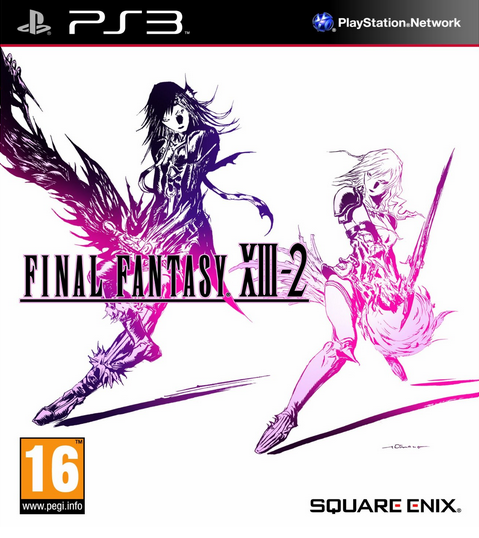
Battle 2: Final Fantasy XIII-2

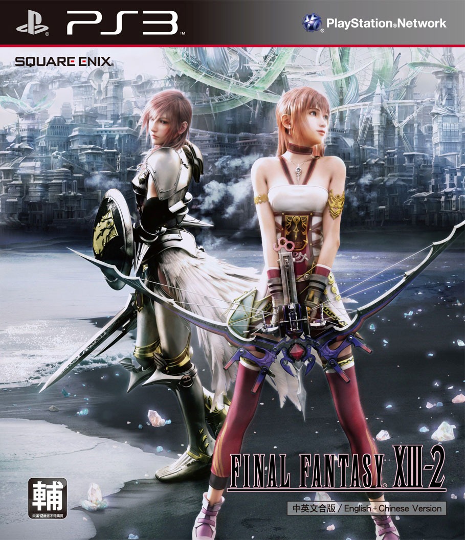
Most of the game’s covers only show Lightning, just like the cover for Final Fantasy XIII. However, she doesn’t play that big of a part in the base game. It’s a decent enough piece, but… it could have been more.
The Hong Kong/Singapore cover not only features Light, but also the actual protagonist of the game: her sister, Serah, as well as a gorgeous background.
For my money gil, however, the best art has to belong to Italy/Russia/the UK, because it actually a blown-up version of the game’s logo courtesy of Yoshitaka Amano. It shows Light and her nemesis, Caius, in a sort of yin-yang design. What can I say? I bagged on the simple, Light-only covers, but Amano made simplicity sing in the logo that he designed for the game.
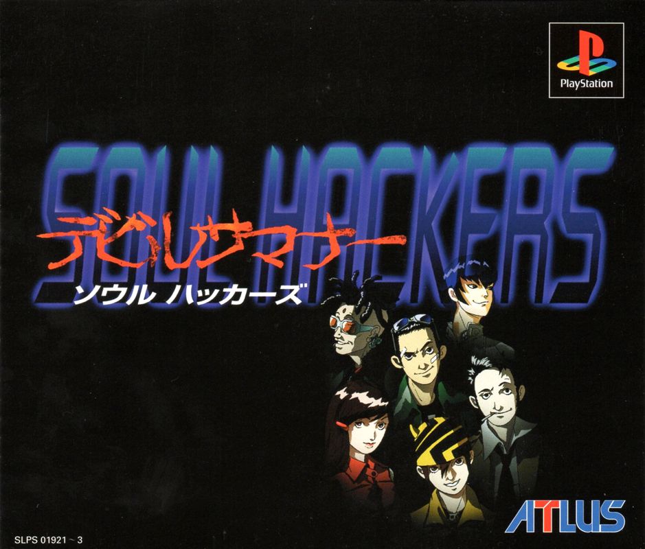
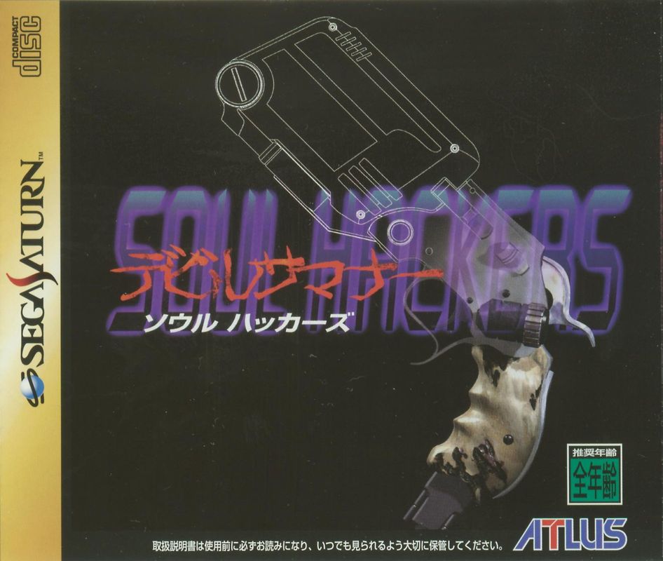
Battle 3: Shin Megami Tensei: Devil Summoner: Soul Hackers
This battle is a bit different because we have a few different systems to compare here between the Nintendo 3DS, PlayStation, and Sega Saturn.
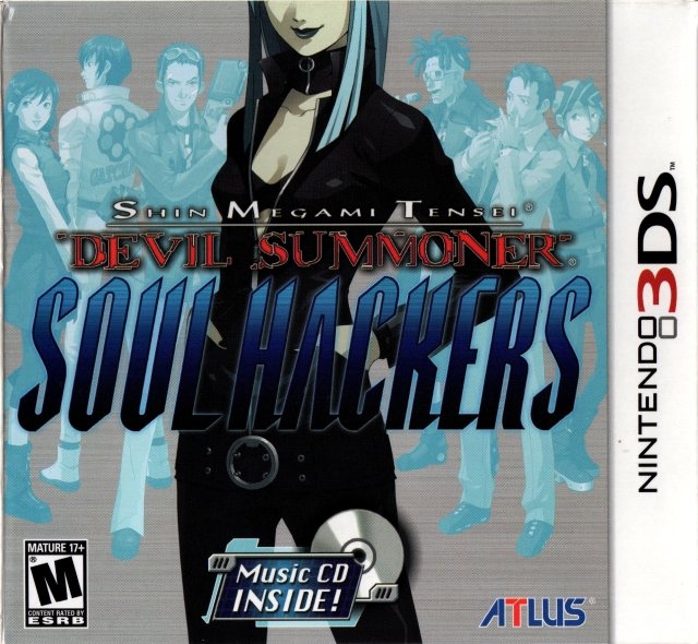
The 3DS port/remake is the clear winner, even if it’s basically just a group shot. We get Nemissa in the forefront with just a bit of her face missing, which is a trope that I actually like because it creates a sense of mystery. Then, we get the rest of the Spookies behind her. The light blue color is cool.
Silver goes to the PS1, though it’s… not great. It’s a congregation of the Spookies’ heads in the lower-right corner on a black background. At least it shows some characters.
Bronze would have to go to the Saturn, because it’s just a gun. If I recall correctly, it’s not even a particularly important gun or anything, just the rarely-seen gun-shaped computer that the protagonist uses to do hacking. This one feels like it received the least amount of effort, though none of these boxes are terrible.
Battle 4: Clock Tower (PS1)
Which of these covers do I like the most? The answer may surprise you.


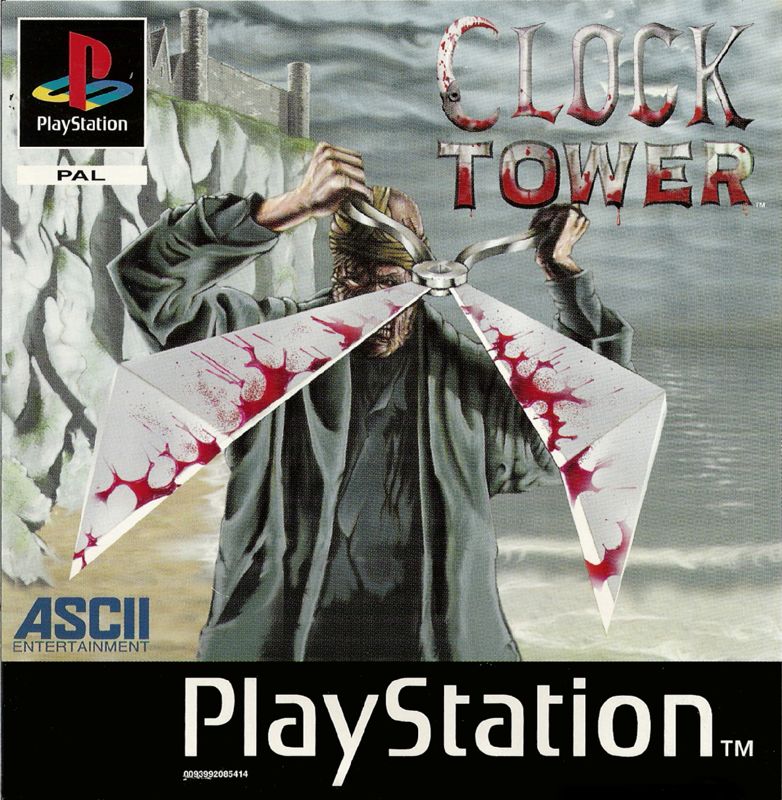
I like the Japanese cover well enough, but I have to give the edge to the US box art, because it’s the most spooky. Even I have to admit that this is a striking image for a horror game. The PAL region cover is similar, but makes unnecessary changes, flipping the image around 180 degrees and jacking the brightness way too high. The people demand a dark and chilling cover, darnit!
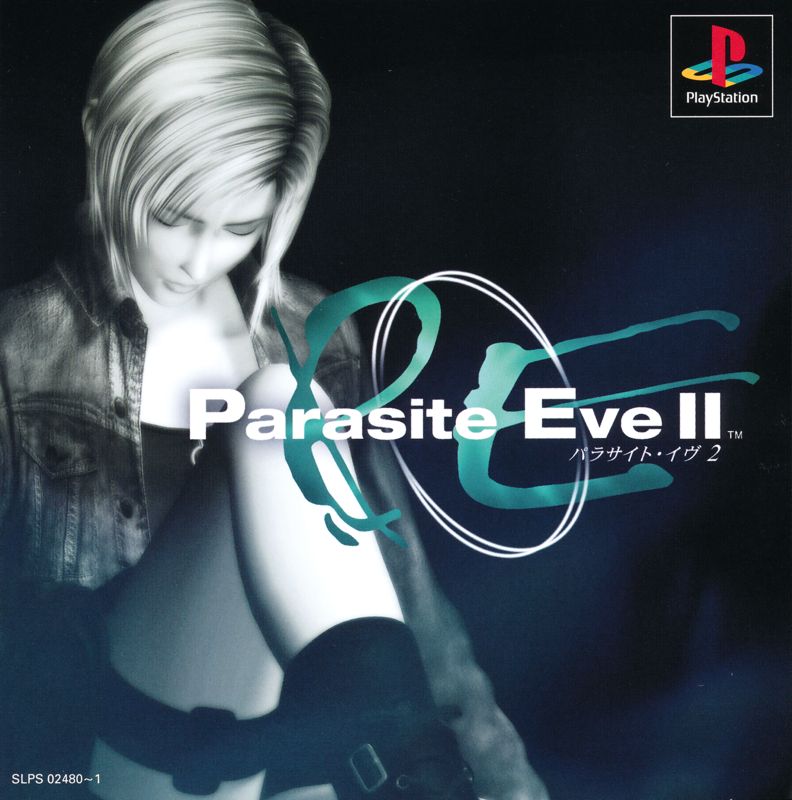
Battle 5: Parasite Eve II
We have three very similar covers here, so it comes down to the backgrounds to determine who reigns supreme.
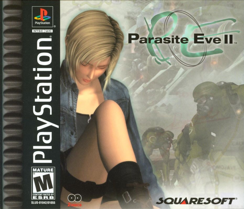
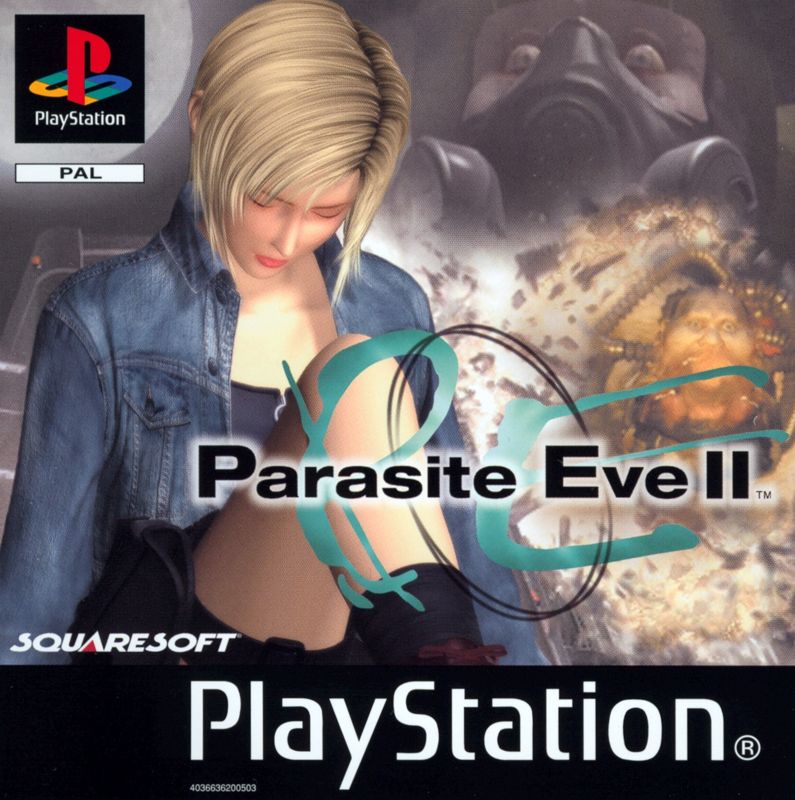
The US version is the most “eh” to me. For Square’s PS1 period, they had a real obsession with gray and smoky background design. It doesn’t help that the background details in this piece are rather hard to parse.
Japan goes up to bat in a strikingly simple piece. The background is dark and moody.
But I think the edge has to go to the cover used in PAL regions. It feels like it succeeded where the US cover failed. It shows the elephant/human hybrid (not that it’s evident from this piece that that’s what he is) looking freaky, and as a result, is the only cover that even remotely hints at the creepier body horror parts of the game.
Battle 6: Shin Megami Tensei: Nocturne
It’s the US versus PAL regions to demonstrate the Demi-Fiend at his best.
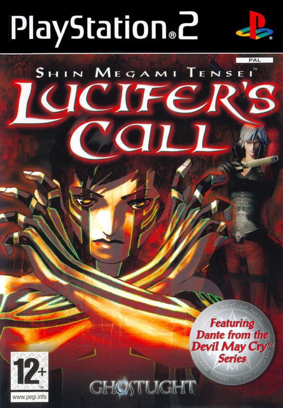

The PAL region overemphasizes the presence of Dante (From the Devil May Cry Series!) in the game as a demon that you can recruit into the party. The image of the Demi-Fiend himself is fine, but the subtitle, Lucifer’s Call, is threatening to crush him. I’m sorry, but this cover is just overstuffed to the point of ugliness. The striking US box art wins, hands down.
